Project Details
Tools
Sketch, Illustrator, InVision, After Effects
Time
Dec. 2016
Role
UX/UI Website Designer
Pokaa Cafe & Bistro Redesign
Pokaa Café & Bistro is a website for a restaurant in the city of Hsinchu in Taiwan that includes all the latest news and related information regarding the restaurant. However, the website is poorly designed. It has redundant information, poor organization, and hard-to-use navigation.
01. Problem
Consumers seem to be suffering from redundant information, poor organization, and hard-to-use navigation on the website. Many consumers have reflected these concerns.
How can we improve the usability of Pokaa Cafe & Bistro's website and help consumers get access to restaurant's information much more easily?
02. Research
Current Problems
1.
Redundant
Information
2.
Poor
Organization
3.
Hard-to-use
Navigation

Website Analysis
The original website's information architecture is shown below. It's a bit different from your standard website information architecture. However, the main takeaway I am trying to illustrate here is that many sections are extremely redundant in displaying information. For example, the picture slides (indicated with a pink star) on the landing page is confusing and messy. The hiring info (shown with a yellow star), the about us info (indicated with a blue star), and location info (shown with a dark grey star) are all redundant and displayed in various places on the website.
As you can see in the diagram below, there is way too much information displayed on the main page. The reservation section takes up too much space, and the disorganized news section also makes the homepage of the website extremely confusing and chaotic to look at.

User Interviews
After analyzing the restaurant's website architecture, I decided to conduct user tests to get real user opinions. The users here will be mainly the customers interested in our restaurant or existing customers who would like to inquire about our restaurant. I was able to conduct user interviews with 4 participants, including two families (three members family, two members family), and two singles. Although this is quite a small number, and many of the feedback may not be enough to be significant, it still offers useful and valuable user insight in improving the usability of this website. Below are the results.


Surveys & Web Statistics
Surveys are conducted, and website statistics are also analyzed on the general use of our website. From the data below, we can conclude that the Main Page of our restaurant serves a vital platform when users are inquiring information.

User's Pain points & Needs
From the user research we have done, here is a summarization of the users pains and need.

03. Goal
To create a cleaner website where users can see all the critical functions on the main page and decide where to go. These functions include the most used tabs such as links to menus, reservations, location and hours info, and latest news from the results we got from our user testing.
New Website Architecture
This is the new Information Architecture of the website based on users' pain points and needs. Much of the redundancy from the old information architecture is simplified. Now information is much easier to find on the Main Page.

04. Prototyping
Wireframes
Mainpage


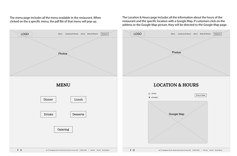
Menu Page
Location & Hours Page

About Page
News & Events Page
Visual Designs

Final UI Demo Video


UI Demo Video
05. Next Steps
This was a project that I did on my own, and I really enjoyed it. However, there is still more user testing to do in the future to test the usability of this website. I want to continue building the user flows for every interaction on the 4 different pages and conduct more user tests before making this website a reality with HTML/CSS.

